
If this hasn’t landed on your radar yet (or you’ve been putting it on the back-burner), it’s time to stop what you’re doing and take notice…
Google has switched to mobile-first indexing (a process that prioritizes the mobile versions of websites over desktop versions).
And that’s changed the way web pages are shown in search results, and even ranked against their competitors.
And why does that matter?
Because it may be affecting how potential customers find (or don’t find) your business’ website, and what impression they walk away with.
Google has been preparing for its mobile-first indexing for the past couple of years, with its large-scale launch starting in March 2018. Yet many businesses still don’t understand what’s changing or how the changes impact their websites.
If that’s you, we’re here to help.
Let’s start by taking a quick look at what mobile-first indexing is and—just as important—what it isn’t.
What’s mobile-first indexing?
Mobile-first indexing is an initiative by Google that changes how the search engine crawls and indexes web pages (or how Google discovers those pages and adds it to its search results).
Prior to the change, Google would default to the desktop version of a website in the crawling, indexing, and ranking process—even if a mobile version existed, and even if the mobile version was used more heavily by site visitors.
Now, with its mobile-first indexing, Google defaults to the mobile version instead, meaning that’s the primary version that gets crawled, cached, included in search results, and ranked.
Google says the switch is all about improving the experience of mobile users:
“…our crawling, indexing,and ranking systems have typically used the desktop version of a page's content, which may cause issues for mobile searchers when that version is vastly different from the mobile version. Mobile-first indexing means that we'll use the mobile version of the page for indexing and ranking, to better help our – primarily mobile – users find what they're looking for.”
The transition to mobile-first indexing is a bold move by Google—but it’s not a surprising one.
The new indexing method follows other steps Google has taken in recent years to incentivize mobile-friendly websites that give smartphone users a better experience, including:
The rollout of “mobile-friendly” labels for websites in mobile search results.
“Mobilegeddon,” an algorithm update that boosted the ranking of mobile-friendly web pages in mobile search results.
The indexing change is just the latest wave of Google’s mobile revolution.
Google shares the first steps for creating a mobile-friendly website.
So now that you know what mobile-first indexing is, let’s cover…
What mobile-first indexing is not
- It’s NOT a separate index just for mobile web pages. Some people are under the misconception that Google is creating a whole separate index just for the mobile versions of websites. This is not the case. Google will continue to use the same main index for all web pages. The only change is in how websites are crawled and added to the index (defaulting to the mobile version instead of the desktop version).
- It does NOT automatically rank mobile sites higher than desktop sites (or mobile sites that haven’t been indexed yet). A web page that has a mobile version indexed will not necessarily have a ranking advantage in Google over another page that only has a desktop version in the index, or over a page that simply hasn’t had its mobile content crawled and indexed yet. What matters most in ranking is the value and relevance of the page content, as well as the quality of the user experience—not how the page was crawled and indexed.
So if a desktop-optimized page is considered by Google to be a better match to a user’s search query (it has the most relevant and helpful content that answers the searcher’s question), that page will still rank higher in the search results.
HOWEVER, businesses should keep this in mind—mobile-friendliness is a ranking fact, and therefore, web pages that aren’t built for optimal performance on mobile devices are more likely to suffer from lower rankings.
So how does this affect your business?
You can find the answer here...
What You Need to Know to Prepare for Mobile-First Indexing
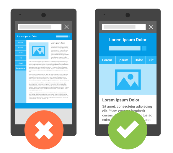
If you have a website with responsive design...
You’re on the right track and you don’t need to worry about any changes to how your site will be crawled and indexed. That’s because you have just one website that works on both desktop and mobile devices, so Google doesn’t need to choose one version of your content over another.
Just continue your efforts to deliver a mobile-friendly experience by ensuring your site is fast, includes mobile-optimized elements like click-to-call functionality, uses media that can be played on all mobile devices (avoid Flash-based video and audio), and so on.
Responsive design allows website content to adjust to fit the size of the user’s screen. (Google)
If you have a separate mobile website (or separate content for mobile users)...
Be sure your mobile site isn’t just a trimmed-down version of your desktop site. Many businesses have separate mobile sites (e.g. “m.” sites) with minimal content and optimization because they view them as “alternate” sites—and that makes the sites less helpful to users and more difficult for search engines to find.
Now that Google is prioritizing the mobile version of your website for its index, it’s more critical than ever to ensure it has the same level of substance and quality as your desktop site.
The same advice applies if you have a dynamic serving website that shows different content to mobile users—you need to make sure your mobile content is on par with your desktop content.
To avoid a drop in search rankings, perform an audit of the content on both versions of your website to see what needs improvement.
You should also review technical website and SEO elements like:
- Metadata: Meta titles and descriptions should be equivalent on both sites.
- Structured data: URLs in structured data for mobile sites/content should be updated to the mobile URLs.
- Sitemaps and robots.txt directives: Make sure Google can properly access your content on both versions of your website and detect mobile-friendly elements on your pages.
- Server capacity: Check that you have enough capacity to handle increased crawl activity on the mobile version of your site.
- Site speed: Improve your page speed as much as possible, especially on your mobile site. This is even more important now that Google has implemented its Speed Update for mobile search rankings (though this update operates separately from the mobile-first indexing initiative).
If you only have a desktop-optimized website...
The good news is your site will be crawled and indexed by Google the same way it always has.
The bad news is your site will continue to deliver a sub-par experience on mobile devices, which puts you at risk of poor search rankings. And with other businesses ramping up their mobile optimization efforts in response to Google’s mobile-first indexing, odds are you’ll fall even further behind your competitors.
Your best bet is to create a mobile-friendly website (responsive design is Google’s recommended approach) so you can truly compete in an ever-increasing mobile-first world—and give your site visitors a better experience with your brand in the process.
Launching a Mobile-Ready Website and Improving Your Organic Rankings in 2019
It may take a while for Google to re-index your web pages, if it hasn’t already. After all, Google’s index includes more than 130 trillion pages.
But that doesn’t mean you should wait around to make changes to your website. Mobile-first indexing has already been launched, and it’s only a matter of time before more businesses start seeing their organic rankings impacted.
If you want to ensure your business can survive (and thrive) in a mobile-first world, take action now!
Whether you need to switch over to responsive design or improve other aspects of your site’s mobile-friendliness, our award-winning web designers are here to help.


.png)
